Re-aligning an Established Mortgage & Insurance brand to today’s smart phone addicted audience – a branding project
A successful digital relaunch often starts long before a new website goes live. In this case, the website project made it clear that the brand itself needed to evolve first, so that the new digital experience would be built on a stronger and more relevant identity.
Before we could move forward with the website relaunch, it became clear that the company’s existing brand was no longer supporting the business in the way it needed to.
The client, a mortgage and home insurance company based in the South East, already had an established name within its local market. That name carried recognition and value, so there was no desire to change it. The issue lay elsewhere.
The wider branding had become dated.
Its colour scheme, typography, and overall visual style felt tired and old-fashioned, which affected how the business was perceived. In a sector where trust, clarity, and approachability matter, the brand was no longer reflecting the kind of experience the company wanted to offer. It lacked warmth, modernity, and the softer, more accessible tone needed to connect with today’s audience.
Because the website relaunch was intended to improve perception and engagement, it made little sense to build a new digital experience on top of an identity that already felt behind the times.
The business needed a refreshed brand that could retain the strength of its established name while modernising everything around it.
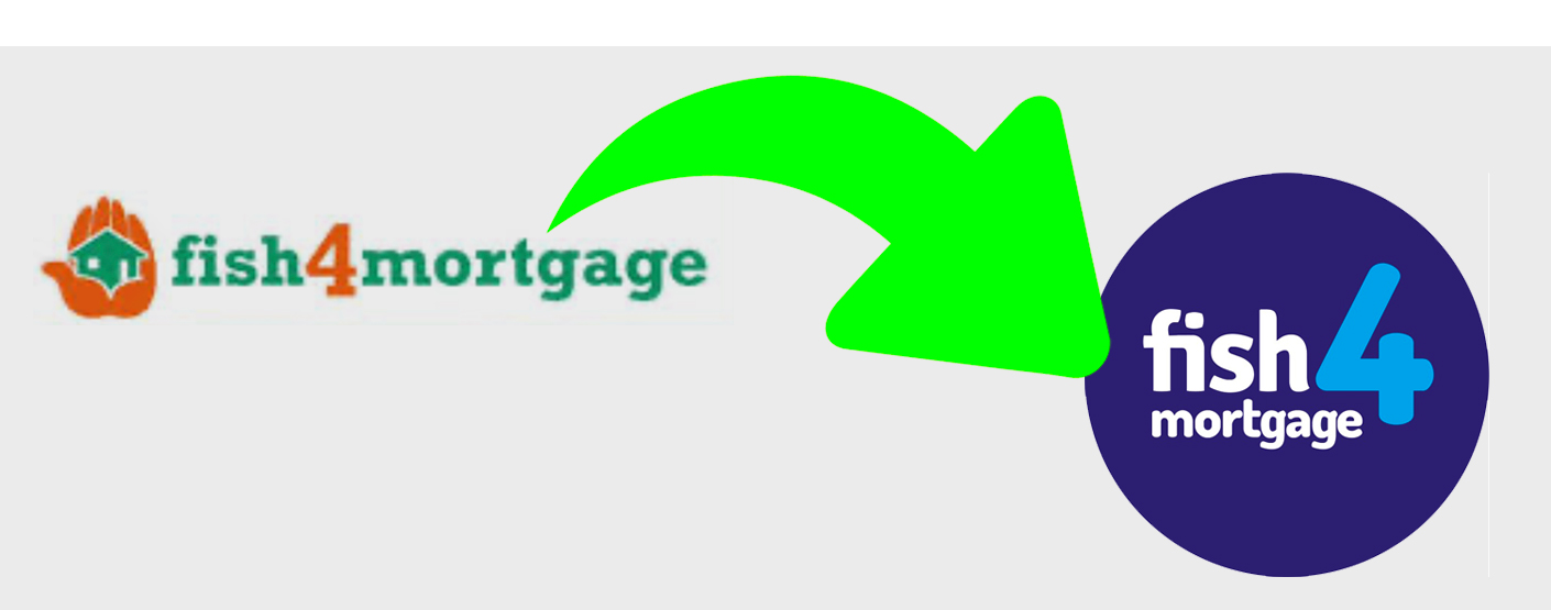
The decision was made to keep the company name but rework the wider brand identity around it.
This allowed the business to preserve its local recognition and existing market equity, while still moving forward with a more contemporary and commercially relevant visual direction.
We updated the iconography, typeface, colour palette, and overall brand ethos, reshaping the identity into something softer, friendlier, and more approachable. The aim was not just to make the brand look newer, but to shift the feel of it entirely — away from something dated and rigid, and towards something more human, welcoming, and confident.
Part of that process involved carefully reconsidering how the brand should be perceived. In a market often dominated by serious, formal, and visually conservative branding, there was an opportunity to create something with a little more warmth and personality. The refreshed identity introduced a lighter, more engaging character while still retaining the sense of trust and professionalism needed in the mortgage and insurance space.
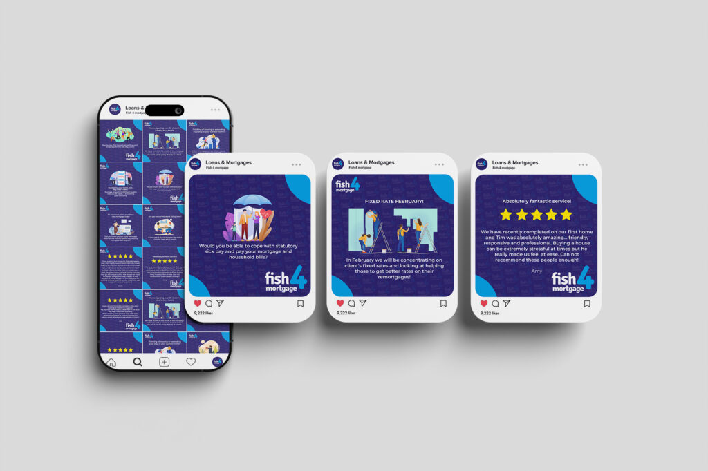
This created a much stronger foundation not only for the website relaunch, but for the company’s wider communications and marketing going forward.
The result was branding that felt more current, more distinctive, and far better aligned with how the business wanted to be seen.
By retaining the company name but modernising the identity around it, the client was able to preserve the recognition they had already built in the area while presenting themselves in a much fresher and more accessible way.
The updated branding softened perception, made the business feel more approachable, and gave it a stronger visual platform for future growth. It also ensured that when the new website launched, it was supported by an identity that felt consistent with the improved digital experience rather than being held back by an outdated look and feel.
What began as a website project became a wider brand transformation — helping the client move forward with a more modern, friendly, and relevant presence in the market.