

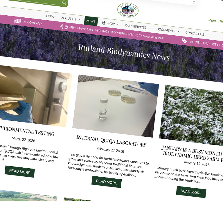
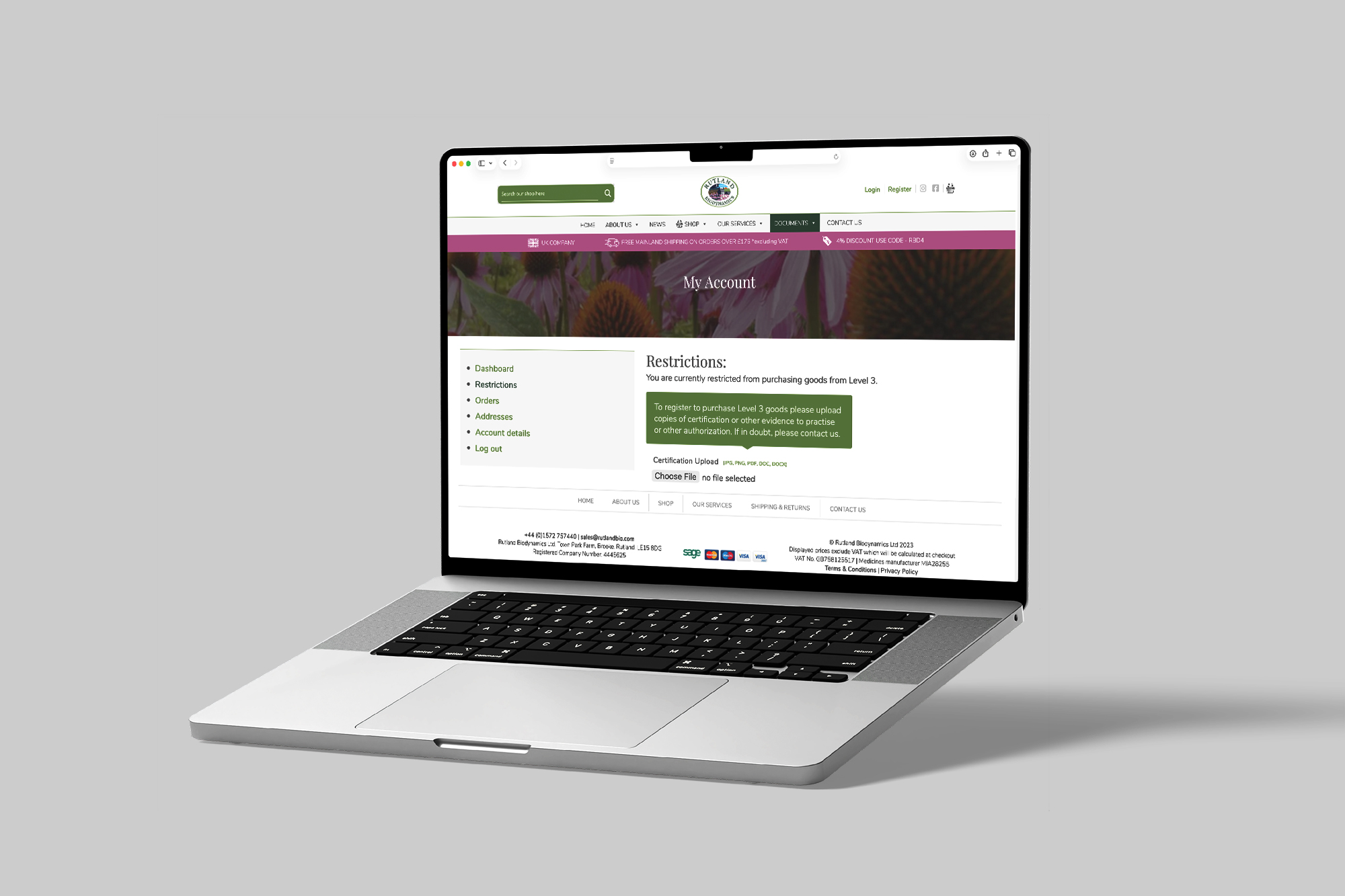
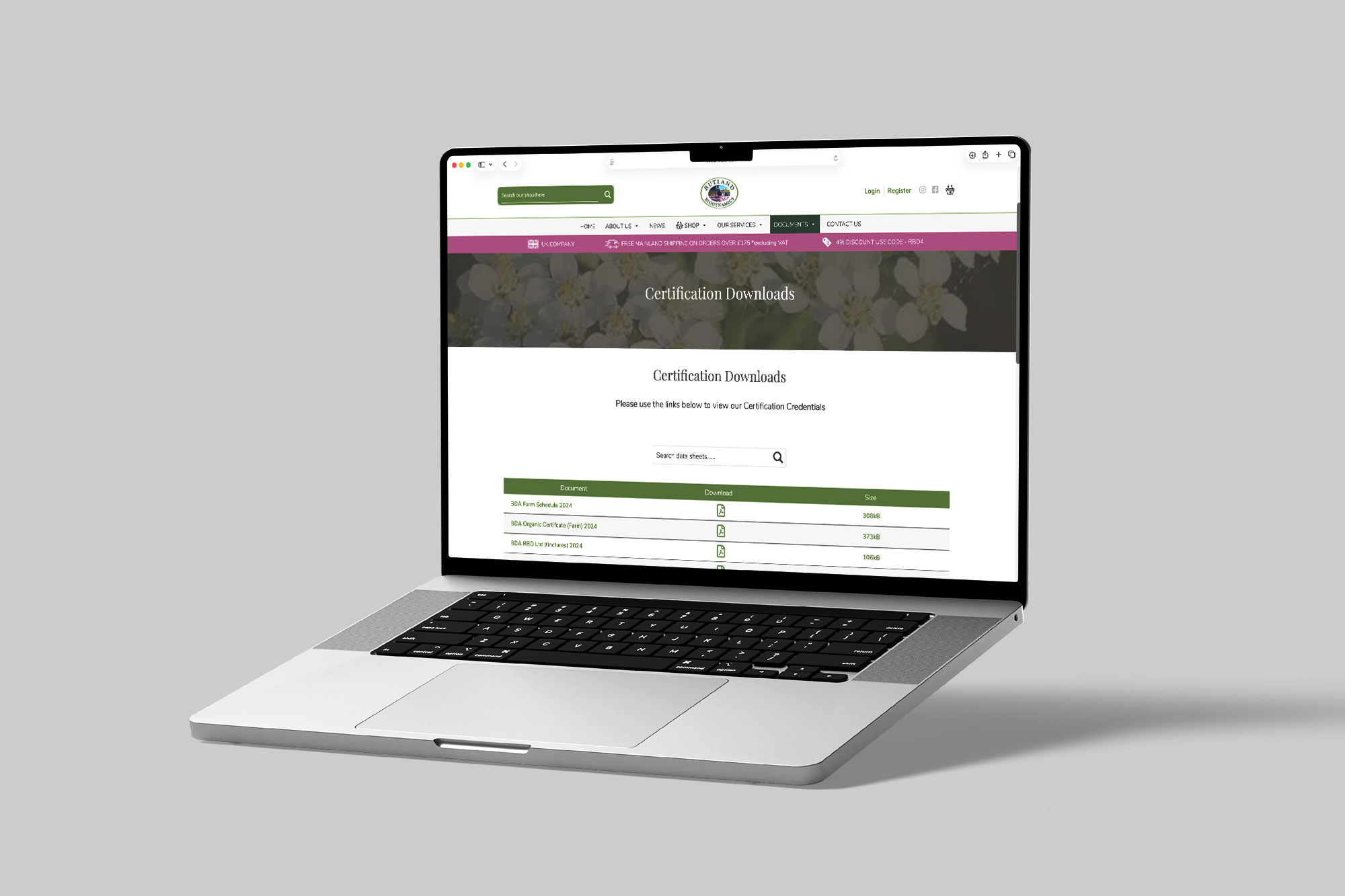
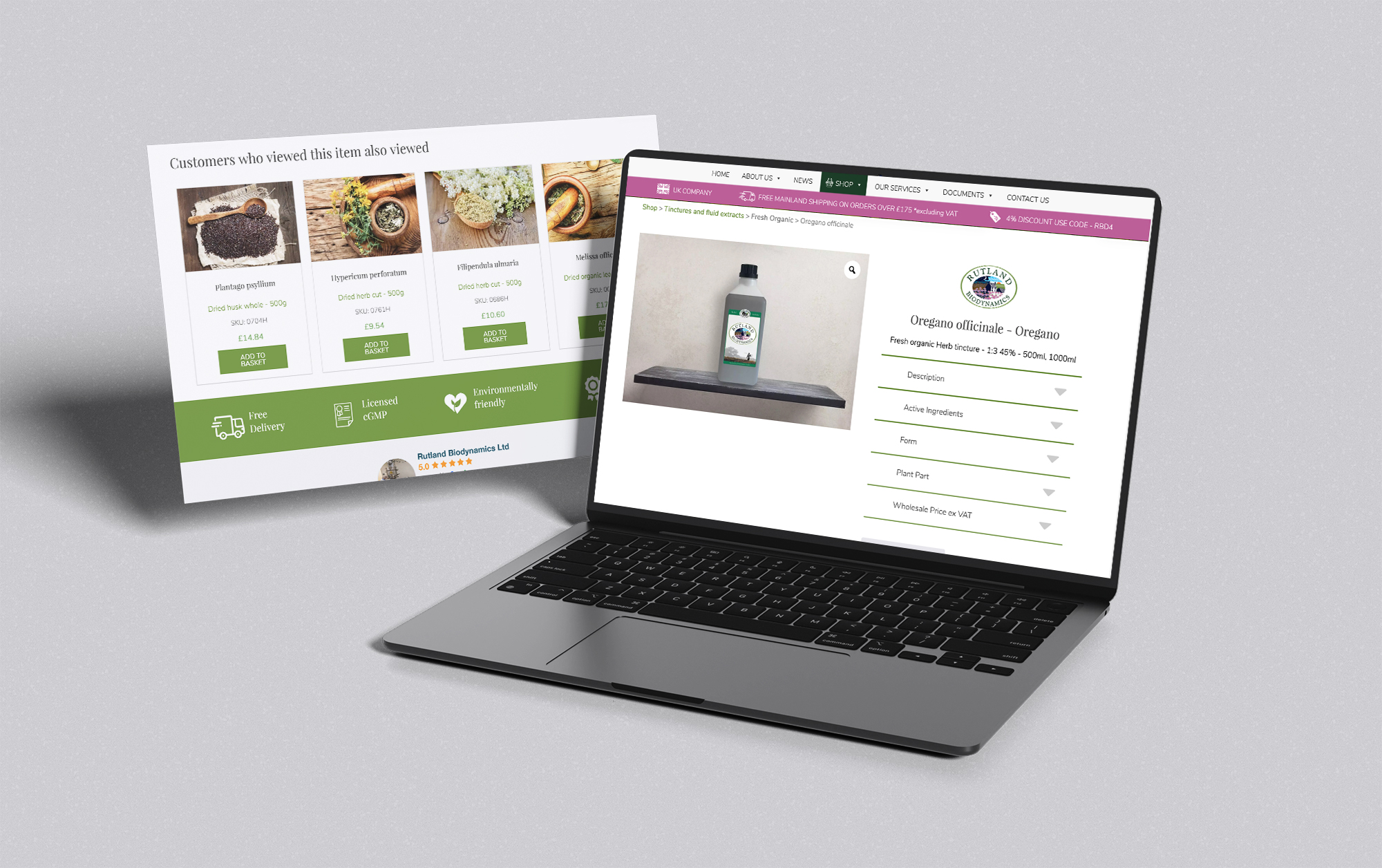
We created a custom WordPress theme and rebuilt the shop around a tiered access model, using custom login functionality so different users could access the products appropriate to their level of privilege. This gave the site a more realistic buying structure for a specialist product environment, where not every customer should see or purchase the same products in the same way. Alongside that, the site was structured to surface important supporting documents such as certification, CoAs and safety information in a much more usable and searchable way.
The platform also needed to stay aware of warehouse stock levels so ordering reflected operational reality rather than functioning as an isolated front end. Later, the system was extended further with an invoicing process that allowed users to access and download invoices from within their account area, helping turn the customer dashboard into a more useful post-purchase space as well as a place to manage access and ordering.
Federation Design’s strategic HubSpot integration empowered G4HI to quadruple work volume without increasing headcount, transforming their digital infrastructure into a market-leading growth engine. This partnership provided crucial industry intelligence and technical agility, streamlining workflows and enabling massive, efficient scaling.
A certified HubSpot partner brings both platform knowledge and implementation experience. That means you get more than just technical setup — you get support with structure, process design, automation, reporting, integration, and long-term optimisation.
Branding is more than just your logo — it is the overall identity of your business and how people recognise, remember and connect with you. It includes your visual style, tone of voice, messaging and the impression you leave on customers. Strong branding helps build trust, makes your business more memorable, and sets you apart from competitors.
Mobile-first web design is an approach where a website is designed for mobile devices before being adapted for larger screens like tablets and desktops. This helps ensure the site works well for the way most people browse today, with clear navigation, faster loading, and a smoother experience on smaller screens. It often leads to better usability, stronger engagement and improved performance overall.