
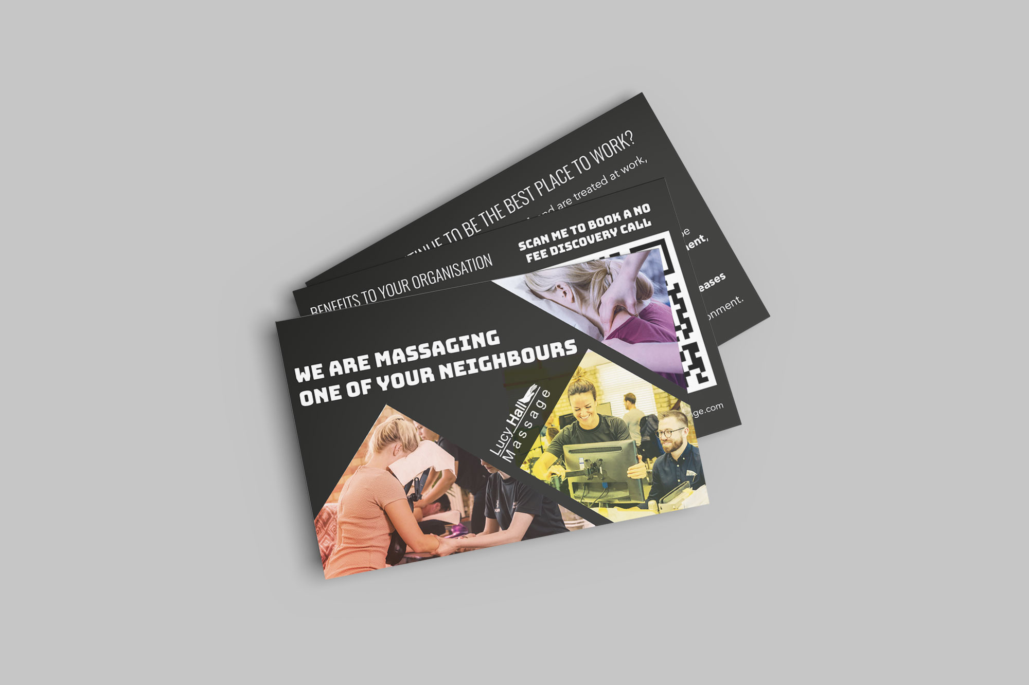
We also report on website performance and, through our growth-driven design methodology, use insights gained from analysing key website KPIs to suggest, plan and implement ongoing improvements to the online presence. This means the websites are not treated as static projects, but as evolving tools that can be regularly refined to improve performance, usability and customer engagement.
Because our support has covered both the customer-facing brand and the systems behind the scenes, the business benefits from a much more joined-up approach to growth. Rather than treating the website, booking journey, marketing assets and technical setup as separate pieces, we help ensure they work together as part of one consistent digital presence. By monitoring performance, reviewing user behaviour and applying ongoing improvements through growth-driven design, we are able to recommend and implement regular updates that keep the online experience effective, relevant and aligned with the needs of the business as it evolves.
Federation Design’s strategic HubSpot integration empowered G4HI to quadruple work volume without increasing headcount, transforming their digital infrastructure into a market-leading growth engine. This partnership provided crucial industry intelligence and technical agility, streamlining workflows and enabling massive, efficient scaling.
A certified HubSpot partner brings both platform knowledge and implementation experience. That means you get more than just technical setup — you get support with structure, process design, automation, reporting, integration, and long-term optimisation.
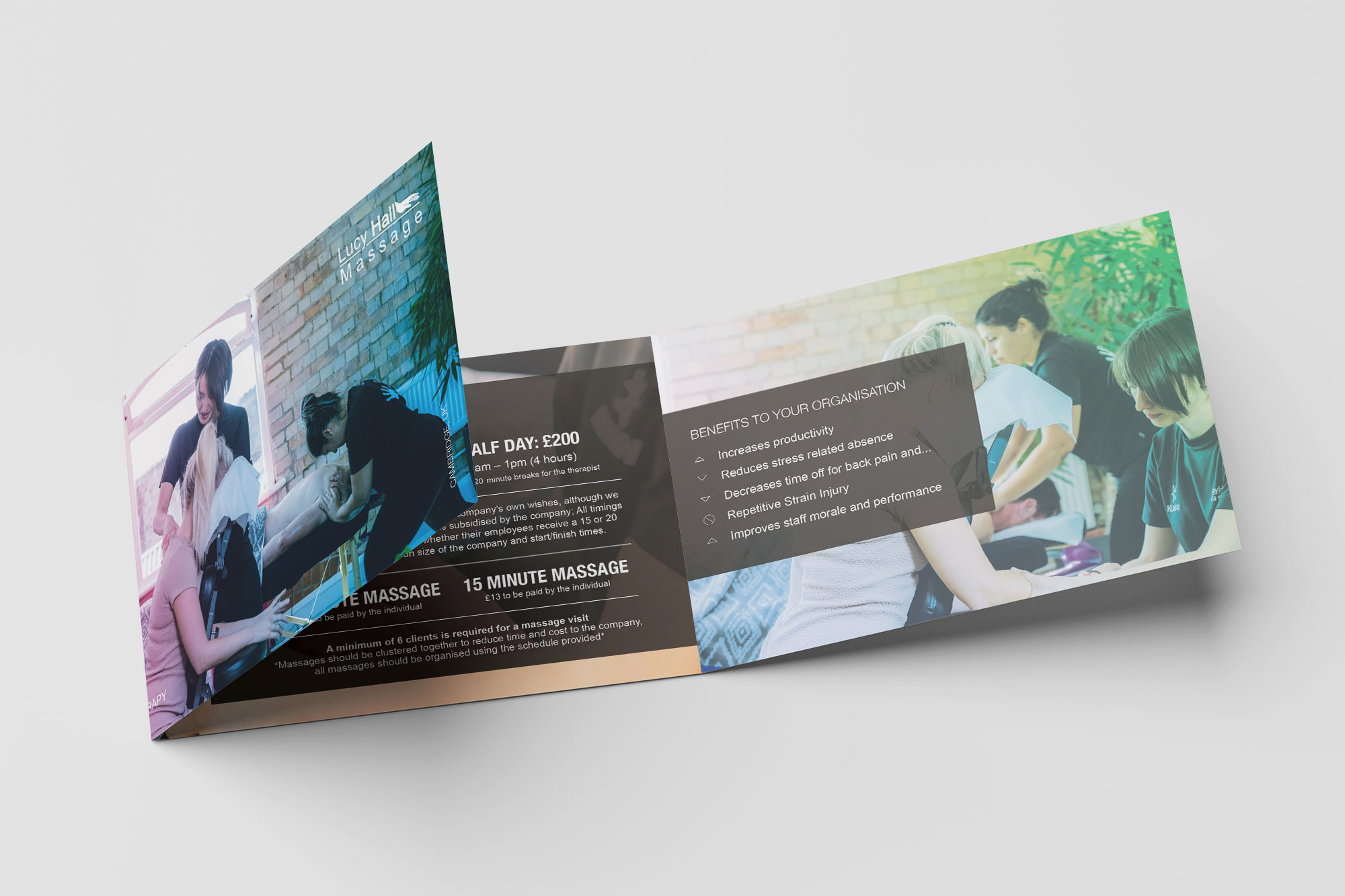
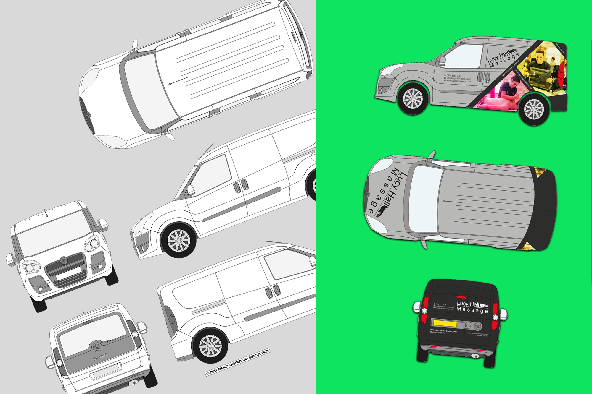
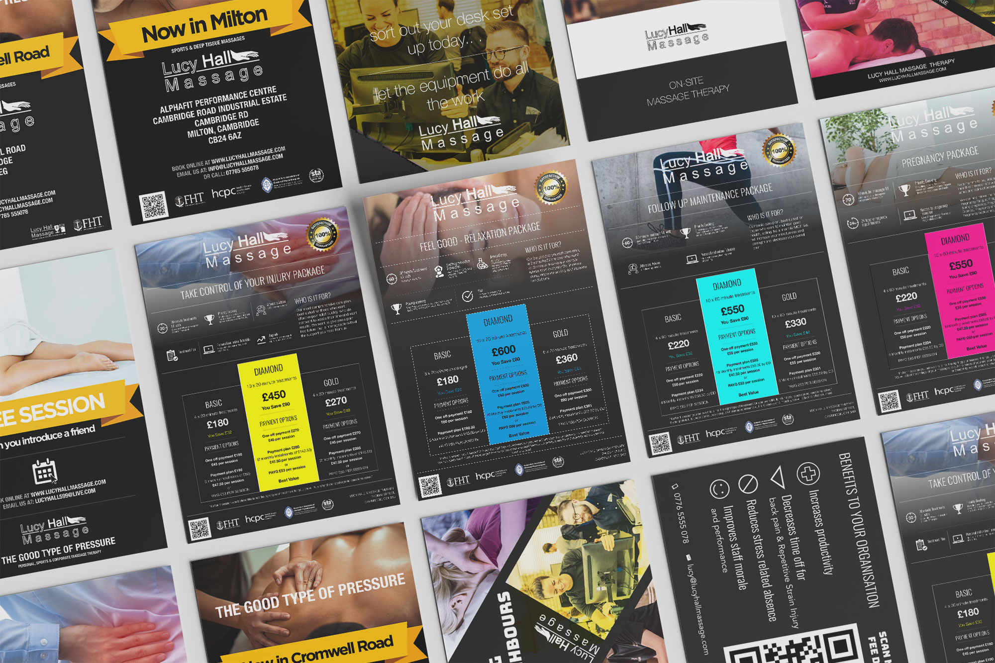
Branding is more than just your logo — it is the overall identity of your business and how people recognise, remember and connect with you. It includes your visual style, tone of voice, messaging and the impression you leave on customers. Strong branding helps build trust, makes your business more memorable, and sets you apart from competitors.
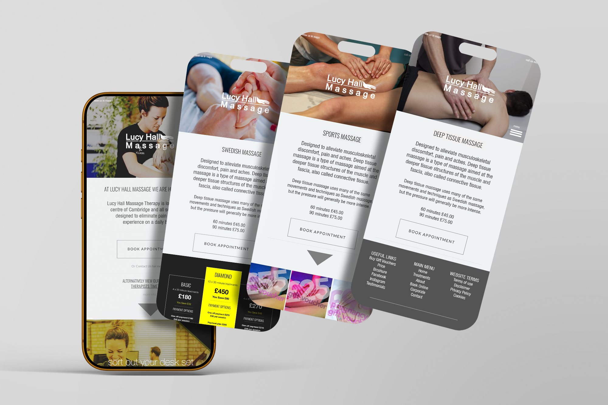
Mobile-first web design is an approach where a website is designed for mobile devices before being adapted for larger screens like tablets and desktops. This helps ensure the site works well for the way most people browse today, with clear navigation, faster loading, and a smoother experience on smaller screens. It often leads to better usability, stronger engagement and improved performance overall.