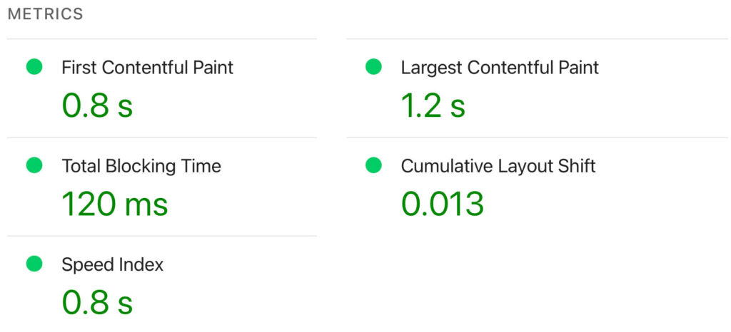
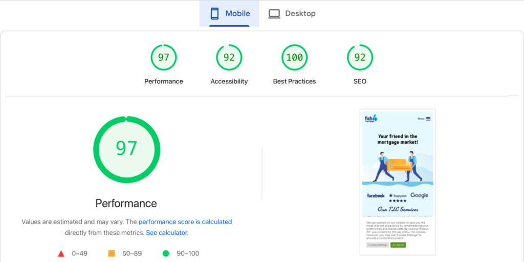
Super-fast load speed of mobiles was the biggest priority
STEVEN G JAMES, DIRECTOR, FEDERATION DESIGN
Relaunching a super quick Website for Mortgage and Insurance Broker designed for a Mobile-First Audience
A successful website relaunch is not just about appearance — it is about aligning design, performance, and usability with real user behaviour. For this client, that meant building a faster, smoother, and more mobile-led experience that reflected how their audience was already engaging online.
We were commissioned to deliver a website relaunch for a mortgage and home insurance company based in the South West. We have produced a few Mortgage Website Design’s in the past and we were recommend by a happy client.
Through analysis of the website’s performance data in Google Analytics, it became clear that a significant majority of users were accessing the site on mobile devices. The problem was that the existing website had not been designed with a mobile-first experience in mind. As a result, the site was underperforming where it mattered most.
Impact wise, this was having a direct effect on user behaviour and costing the business actual loss of revenue.
The poor mobile experience was contributing to a high bounce rate and reducing meaningful interaction with the website, making it harder for prospective clients to engage with the business online. For a company operating in a competitive sector where trust, clarity, and ease of contact are critical, this was a serious issue.
It was decided that the relaunch of the new mortgage website design needed to achieve three clear objectives:
The website needed to be fast, with performance improvements helping to reduce bounce rates and create a smoother user experience.
The website needed to look and perform well on mobile, reflecting the fact that most visitors were accessing the site on smaller screens.
The website needed to function more like an app, with intuitive navigation, easy scrolling, and a simpler, more seamless journey for the user.
To meet the first objective, we launched the new website on Amazon AWS hosting, giving the project a far stronger technical foundation than the previous setup. Because AWS is scalable and performance-led, it allowed the website to deliver faster load times and a more reliable user experience. This was especially important for reducing friction at the point of entry and supporting a smoother journey for mobile users, where speed has a direct effect on bounce rate and engagement.
How AWS Web Servers Deliver Fast Loads
Achieving the second objective by taking a mobile-first design approach, makes mobile users the primary audience and desktop users secondary. Rather than simply adapting a desktop website for smaller screens, the new experience was designed around how the majority of users were actually accessing the site. This meant the layout, content hierarchy, navigation, and calls to action were all structured to perform properly on mobile.
We achieved the third goal by designing the interface to feel more like a mobile app than a traditional website. This included using tile-based content blocks, button-led navigation, and cleaner interaction patterns commonly seen in app design, helping the user journey feel more intuitive and familiar on mobile. We also introduced smooth scrolling behaviour through CSS, creating a more fluid, effortless browsing experience that reinforced the app-like feel of the site.
A successful website relaunch is not just about appearance — it is about aligning design, performance, and usability with real user behaviour. For this client, that meant building a faster, smoother, and more mobile-led experience that reflected how their audience was already engaging online.
That kind of trend reinforces the importance of designing for mobile behaviour first, not as an afterthought.
Through analysis of the website’s performance data in Google Analytics, it became clear that a significant majority of users were accessing the site on mobile devices. The problem was that the existing website had not been designed with a mobile-first experience in mind. As a result, the site was underperforming where it mattered most.
This was having a direct effect on user behaviour.
The poor mobile experience was contributing to a high bounce rate and reducing meaningful interaction with the website, making it harder for prospective clients to engage with the business online. For a company operating in a competitive sector where trust, clarity, and ease of contact are critical, this was a serious issue.
It was decided that the relaunch of the new website needed to achieve three clear objectives:
The website needed to be fast, with performance improvements helping to reduce bounce rates and create a smoother user experience.
The website needed to look and perform well on mobile, reflecting the fact that most visitors were accessing the site on smaller screens.
The website needed to function more like an app, with intuitive navigation, easy scrolling, and a simpler, more seamless journey for the user.
To meet the first objective, we launched the new website on Amazon AWS hosting, giving the project a far stronger technical foundation than the previous setup. Because AWS is scalable and performance-led, it allowed the website to deliver faster load times and a more reliable user experience. This was especially important for reducing friction at the point of entry and supporting a smoother journey for mobile users, where speed has a direct effect on bounce rate and engagement.
Delivering faster load times and a more reliable user experience.
Achieving the second objective by taking a mobile-first design approach, makes mobile users the primary audience and desktop users secondary. Rather than simply adapting a desktop website for smaller screens, the new experience was designed around how the majority of users were actually accessing the site. This meant the layout, content hierarchy, navigation, and calls to action were all structured to perform properly on mobile.
We achieved the third goal by designing the interface to feel more like a mobile app than a traditional website. This included using tile-based content blocks, button-led navigation, and cleaner interaction patterns commonly seen in app design, helping the user journey feel more intuitive and familiar on mobile. We also introduced smooth scrolling behaviour through CSS, creating a more fluid, effortless browsing experience that reinforced the app-like feel of the site.
When most users are already engaging on mobile, a successful relaunch is not just about how a website looks. It is about creating a clearer brand, a faster technical foundation and a user experience built around how people actually behave online.
AWS states Amazon EC2 offers a 99.99% availability SLA and can scale capacity within minutes.
For businesses in mortgage and insurance, digital experience matters in a slightly different way to many other sectors. Customers are not browsing casually; they are often engaging during a stressful, high-stakes decision, and they need clarity, reassurance and ease of contact from the outset. In that environment, brand perception is shaped not only by visual identity, but by how trustworthy, approachable and frictionless the overall experience feels. Rebranding can play an important role here, not simply by refreshing appearance, but by restoring consistency across touchpoints and making the business easier to understand and engage with. At the same time, mortgage branding is closely tied to trust and differentiation, because customers want to work with people and businesses they feel they can rely on when making major financial decisions.
That was the challenge in this project. The client, a mortgage and home insurance business in the South East, needed a website relaunch that did more than modernise the look and feel. Analysis of their Google Analytics data showed that the majority of users were already visiting on mobile, yet the existing experience had not been designed with mobile use as the priority. The result was familiar: too much friction, too much drop-off, and not enough meaningful engagement from the audience the business most needed to reach. The client did not simply need a nicer website. They needed a stronger digital foundation that matched real user behaviour and made it easier for prospective customers to move forward with confidence.
The relaunch therefore focused on three connected goals. First, the brand needed to feel clearer, warmer and more contemporary. Second, the user experience needed to be designed around mobile as the primary environment rather than treated as a reduced version of desktop. Third, the hosting environment needed to be strong enough to support better performance and a more reliable experience from the first interaction onward. Those three areas are closely linked. A rebrand can improve how a business is perceived, but if the site is slow or difficult to use on mobile, the value of that work is quickly undermined. Equally, a mobile-first interface can improve usability, but without a coherent brand it may still fail to create the reassurance that matters so much in financial services.
The rebrand was important because it helped the client present the business in a way that felt more aligned with customer expectations. In sectors like mortgages and insurance, people are often looking for guidance as much as they are looking for a product.
A brand that feels too corporate, too dated or too impersonal can create distance at exactly the moment a prospective customer needs confidence.
A well-executed rebrand helps re-establish consistency and coherence across touchpoints, while also creating an opportunity to review how the wider brand system supports the business commercially. In this case, the relaunch helped the client move towards a more approachable, usable and relevant digital presence, without losing the seriousness and professionalism required in the category.
From a UX perspective, the mobile-first decision was critical. Mobile-first design is not simply responsive design by another name; it starts from the constraints of smaller screens and focuses on the content, actions and navigation that are most essential to the user. That makes it especially effective in situations where clarity and speed matter. The Interaction Design Foundation describes mobile-first as an approach that focuses on what is indispensable for users, improving usability by forcing greater prioritisation of content and features. It also notes that faster, lighter pages and clearer interfaces improve the overall experience, particularly for mobile users who may be on the move or working with limited attention.
That principle shaped the new site. Rather than adapting a desktop layout downwards, the experience was designed around how the majority of users were already arriving. Layout, hierarchy, navigation and calls to action were all structured primarily for smaller screens.
The interface was made to feel closer to an app than a traditional website, using cleaner content blocks, more intuitive navigation patterns and smoother scrolling behaviour to reduce friction and make the journey feel more natural. This matters because good UX is often less about adding features and more about reducing hesitation. When the offering is clear and the path through it is simple, adoption tends to improve because users are not being asked to work hard just to understand what to do next. That is particularly important in a competitive market where alternative providers are only a few taps away.
The technical foundation mattered just as much as the interface. To support the relaunch, the new website was deployed on AWS cloud hosting. AWS describes its hosting platform as offering scalable web hosting options, broad platform support, worldwide infrastructure and flexible pricing, while also supporting managed deployment and hosting services for modern websites and web applications. For this project, that mattered because performance was not a secondary technical detail; it was part of the user experience. Faster load times reduce friction at the point of entry, create a smoother first impression and support stronger engagement on mobile, where even small delays can increase abandonment. AWS also offered the kind of scalable and dependable environment that made the relaunch more robust over time, rather than simply delivering a short-term front-end refresh.
This also reflects a wider market reality. Ofcom reported in late 2025 that UK mobile data usage had risen by nearly a fifth year on year to more than 1.2 billion GB each month, while 5G data usage grew by more than half. That kind of trend reinforces the importance of designing for mobile behaviour first, not as an afterthought.
As more online engagement happens through phones, the businesses that perform best are usually the ones whose infrastructure, brand and UX are aligned around that reality.
The value of the project, then, was not just that the client received a rebrand, a new website and a cloud hosting upgrade. It was that those three elements worked together. The rebrand helped create a more coherent and approachable identity. The mobile-first design reduced friction and made the site better suited to real user behaviour. The AWS hosting environment gave the site a stronger technical base to perform more reliably. Together, they gave the client a more effective digital platform: one that looked clearer, worked better and supported a smoother path from first visit to meaningful engagement.