The rebrand respected the Institute’s past without being constrained by it.
STEVEN G JAMES, DIRECTOR, FEDERATION DESIGN
How a Softer, More Structured Identity Helped Modernise this Charity
For organisations working in emotionally sensitive spaces, branding has to do more than look professional. It has to create trust, reduce anxiety and communicate a sense of care, structure and reassurance from the very first interaction.
That was the challenge with this rebrand for the Institute of Family Therapy. The organisation already had a long-established visual identity with clear historical roots, but over time the logo had become visibly dated and less effective in communicating what the Institute needed it to communicate in the present.
While the original mark was true to its origins and still carried a sense of heritage, it no longer felt fully fit for purpose for a modern audience.
That matters more in some sectors than others. In this case, the organisation works with people who may be approaching it during periods of stress, uncertainty or emotional difficulty. For those audiences, visual tone is not a minor design decision. It plays a part in how approachable, stable and trustworthy the organisation feels. A brand that appears cold, severe or simply out of date can create distance at exactly the point where reassurance matters most.
The challenge, then, was not to discard the Institute’s history, but to help it carry that history forward in a more useful way. Good rebranding often sits in that tension. If you move too little, the identity remains trapped in the past. Move too far, and the organisation risks losing the familiarity and recognition built up over many years. In practice, logos and visual identities need care over time. Even strong, meaningful marks need attention and occasional refreshment if they are to remain relevant, usable and appropriate to the audiences they serve.
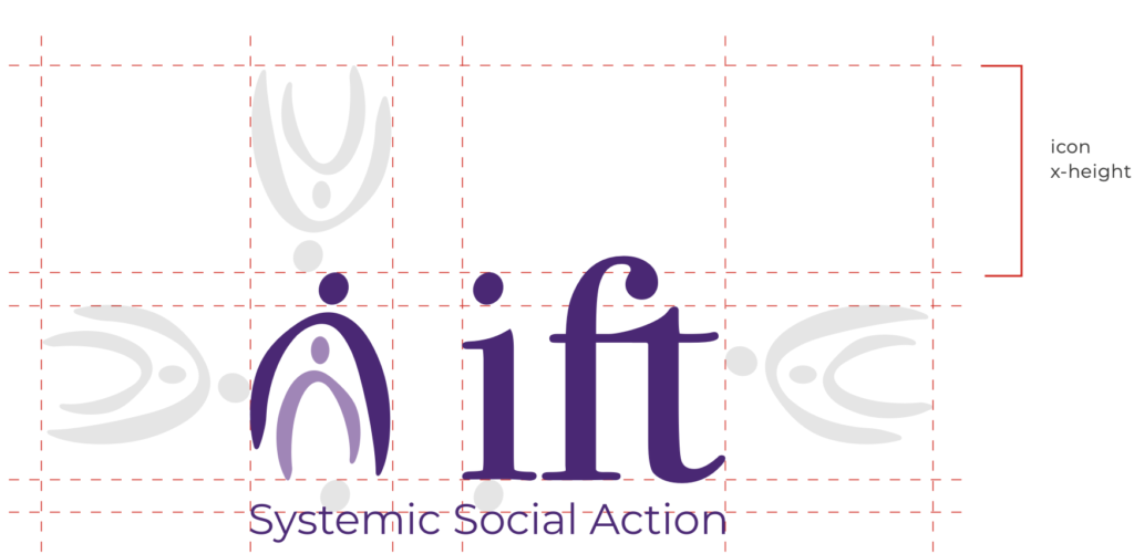
In this case, the answer was not a complete break from the old identity. One of the most recognisable features of the original logo — the arches — was retained, but reinterpreted in a softer, more contemporary way. That was important because it allowed the new mark to remain visibly connected to the Institute’s heritage, while still evolving its tone.
The arches had always carried symbolic weight, and by preserving them the rebrand kept hold of a recognisable piece of the organisation’s visual DNA.
What changed was the way those elements were drawn and expressed. In the new logo, the arches were reworked with a softer, more fluid brushstroke quality. This shifted the identity away from something that felt rigid or institutional and towards something more human, calm and approachable. At the same time, the mark retained enough structure to communicate reliability, professionalism and containment. That balance was central to the whole project. The logo needed to feel gentle, but not vague. Supportive, but not informal. Contemporary, but not trend-driven.
The new identity also introduced the tagline “Systemic Social Action.” This gave the brand a stronger verbal expression of what the Institute stands for and how it thinks. For an organisation rooted in the systemic approach, that phrase carries particular meaning. Systemic work is not only concerned with the individual in isolation, but with the relationships, structures and wider contexts that shape people’s lives. The tagline helped make that philosophy more visible. It suggested that the Institute’s work is not just therapeutic in a narrow clinical sense, but connected to a broader understanding of people, families, relationships and social systems.
That was an important shift because the rebrand needed to express not only warmth, but purpose. “Systemic Social Action” helped connect the Institute’s heritage in family therapy with a more contemporary, outward-looking identity. It added a layer of clarity that the logo alone could not provide, giving the organisation a stronger sense of voice as well as a stronger visual system.
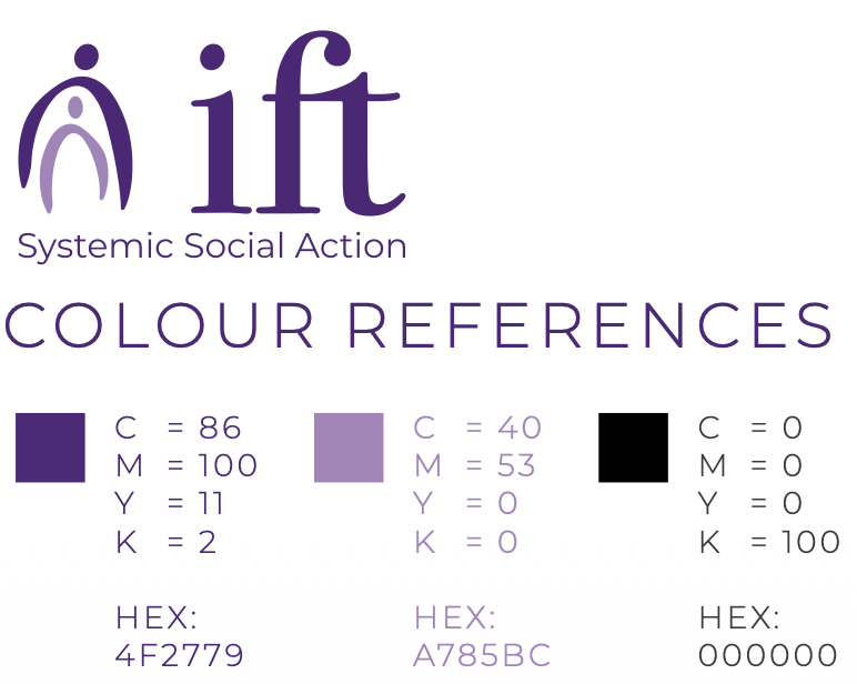
A key part of the rollout was the creation of a detailed brand guidelines document, designed to help the Institute manage the new identity with consistency and confidence long after the rebrand had launched.
This was about much more than handing over a logo pack. The guide contained everything needed to ensure compliant use of the brand was upheld.
The guide explained the thinking behind the identity, setting out the principles that underpinned the mark — simplicity, memorability, timelessness, versatility and appropriateness — and reinforcing the idea that the logo had been designed not as a fashionable gesture, but as a durable, practical and audience-sensitive identity system.
Just as importantly, the document translated those principles into day-to-day brand management. It included guidance on technical file usage, scaling, print and digital reproduction, colour handling and artwork formats, helping staff, suppliers and partners understand how to use the logo correctly in different contexts. Pages explaining the practical differences between file types and vector artwork helped make the identity easier to apply properly across professional print, office software, presentations, websites and other digital uses. In that sense, the guidelines became part of the rebrand itself: not just a support document, but a practical tool for protecting the clarity, softness and professionalism of the new identity over time.
The result was a rebrand that respected the Institute’s past without being constrained by it. The refreshed logo retained the recognisable arches that connected it to its heritage, but reworked them into a softer and more contemporary form. The new tagline gave the organisation’s systemic philosophy a clearer public expression. And the guidelines ensured that the identity could be used consistently and confidently wherever it appeared.
Taken together, the project gave the Institute a brand that felt more relevant, more human and better aligned with the emotional realities of the people it supports. It was not simply a visual refresh. It was a careful repositioning of a long-established identity so that it could continue doing its job in the present: creating trust, communicating care and reflecting the values of an organisation working in a highly sensitive and deeply human field.