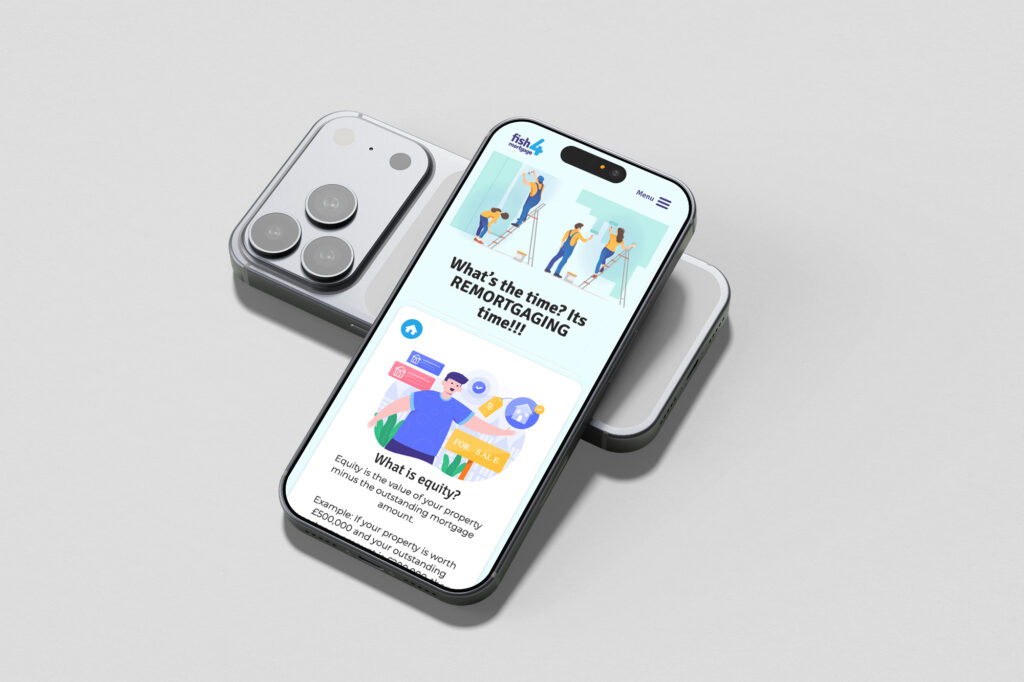
Rebranding and Relaunching a Mortgage & Insurance Website for a Mobile First Audience
A successful website relaunch is not just about appearance — it is about aligning design, performance, and usability with real user behaviour. For this client, that meant building a faster, smoother, and more mobile-led experience that reflected how their audience was already engaging online.
We were commissioned to deliver a website rebrand and relaunch for a mortgage and home insurance company based in the South East.
Through analysis of the website’s performance data in Google Analytics, it became clear that a significant majority of users were accessing the site on mobile devices. The problem was that the existing website had not been designed with a mobile first experience in mind. As a result, the site was underperforming where it mattered most.
This was having a direct effect on user behaviour. The poor mobile experience was contributing to a high bounce rate and reducing meaningful interaction with the website, making it harder for prospective clients to engage with the business online. For a company operating in a competitive sector where trust, clarity, and ease of contact are critical, this was a serious issue.
It was decided that the relaunch of the new website needed to achieve three clear objectives:
The website needed to be fast, with performance improvements helping to reduce bounce rates and create a smoother user experience.
The website needed to look and perform well on mobile, reflecting the fact that most visitors were accessing the site on smaller screens.
The website needed to function more like an app, with intuitive navigation, easy scrolling, and a simpler, more seamless journey for the user.
To meet the first objective, we launched the new website on Amazon AWS hosting, giving the project a far stronger technical foundation than the previous setup. Because AWS is scalable and performance-led, it allowed the website to deliver faster load times and a more reliable user experience.
This was especially important for reducing friction at the point of entry and supporting a smoother journey for mobile users, where speed has a direct effect on bounce rate and engagement.
Achieving the second objective by taking a mobile first design approach, makes mobile users the primary audience and desktop users secondary. Rather than simply adapting a desktop website for smaller screens, the new experience was designed around how the majority of users were actually accessing the site. This meant the layout, content hierarchy, navigation, and calls to action were all structured to perform properly on mobile. This is the benefit of a mobile first site.
We achieved the third goal by designing the interface to feel more like a mobile app than a traditional website. This included using tile-based content blocks, button-led navigation, and cleaner interaction patterns commonly seen in app design, helping the user journey feel more intuitive and familiar on mobile. We also introduced smooth scrolling behaviour through CSS, creating a more fluid, effortless browsing experience that reinforced the app-like feel of the mobile first site.